
Category Brand Identity

The context:
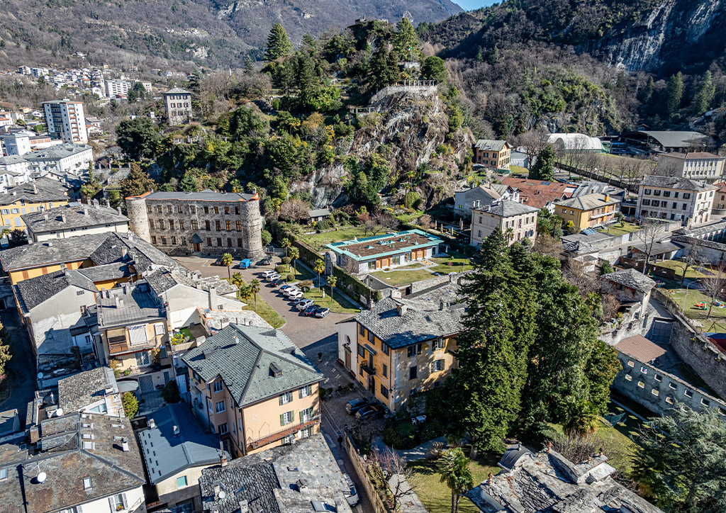
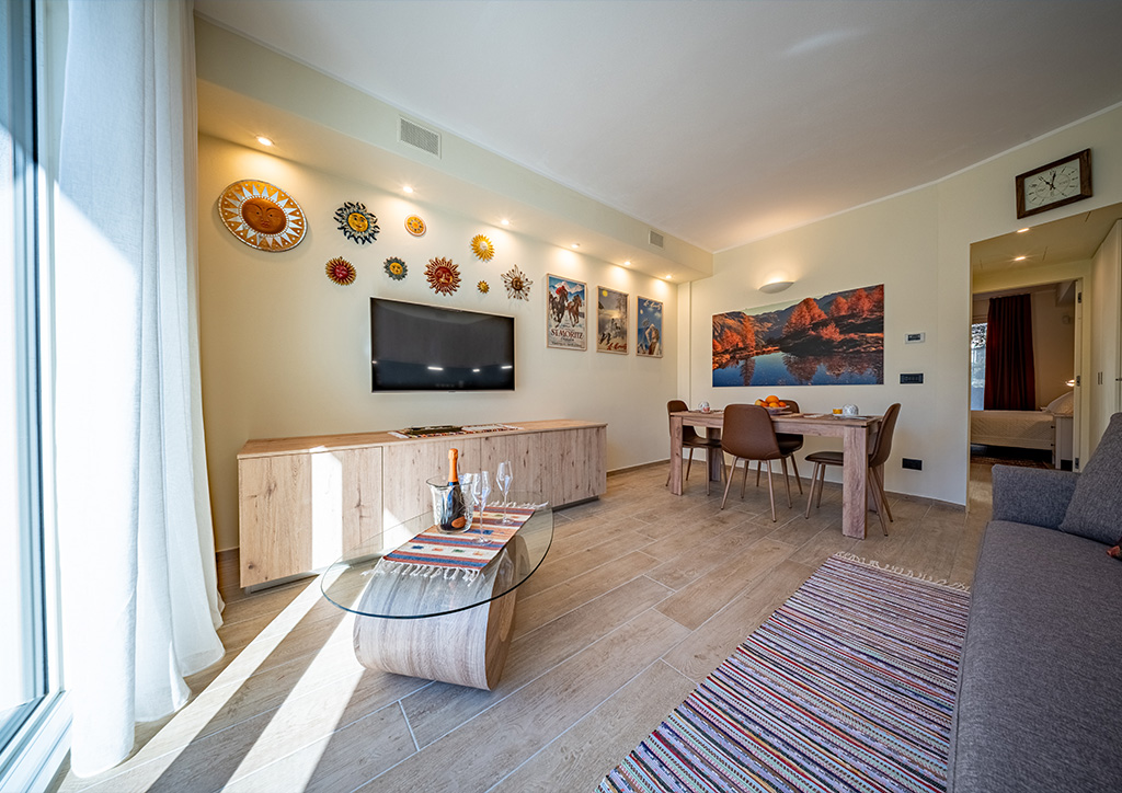
Piazza Castello Locazioni Turistiche is a cozy one-bedroom apartment in the heart of Chiavenna’s historic center. It is located just a few steps from Piazza Castello, in a strategic position to experience the city in every season.The accommodation is designed for couples, curious travelers, and mountain lovers. It offers an authentic experience, combining history, nature, and local life. It is ideal both in spring and summer, as well as during autumn and winter.
The project started with the identification of clear communication goals and values. The aim was to visually convey the identity of the place. From this, the development of a coherent and recognizable visual system took shape.
Visual collection:
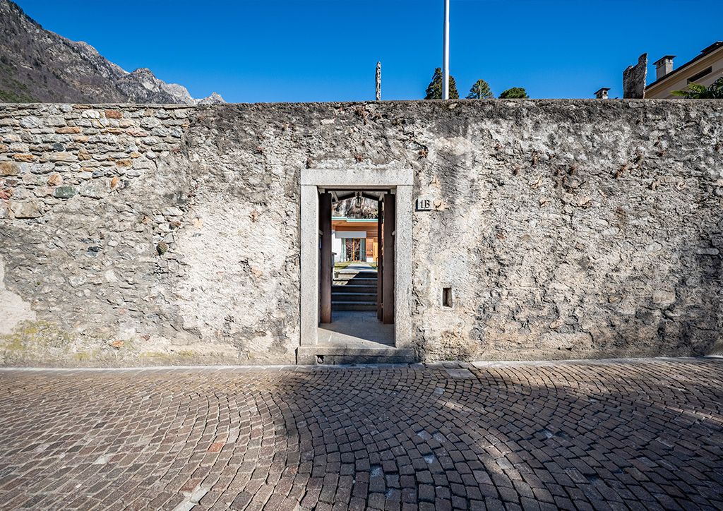
I created a collection of images to define atmosphere, mood, and style. This step was essential to capture the nuances of the place and translate them into an authentic and coherent visual identity.

The color palette:
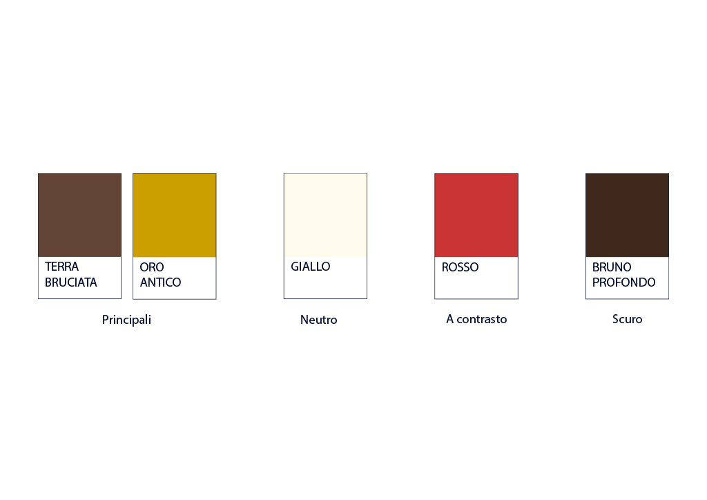
The color palette interprets the materials, surfaces, and tones that define the urban fabric, translating them into a contemporary visual language.The burnt earth tone conveys solidity, authenticity, and continuity with the historic facades. Antique gold becomes a distinctive element of the identity, symbolizing exclusivity and the central position of Piazza Castello in the heart of the city.
The neutral yellow acts as a luminous and balancing base, recalling natural stone and enhancing readability and harmony. Red, used as an accent color, introduces dynamism and energy, creating focal points without compromising the overall balance.
The deep brown reinforces the visual identity by adding depth and elegance, highlighting the robust and timeless character of Chiavenna’s architecture. The result is a coherent, recognizable visual system rooted in the historical context.
The logo:
The pictogram brings together the main visual elements of the project. The house represents hospitality. The castle recalls the history of the place. The composition is essential and well-balanced.The typographic choice focuses on a timeless and elegant typeface. It engages in dialogue with the historical context while maintaining a contemporary aesthetic. The logo is clean, recognizable, and versatile.
