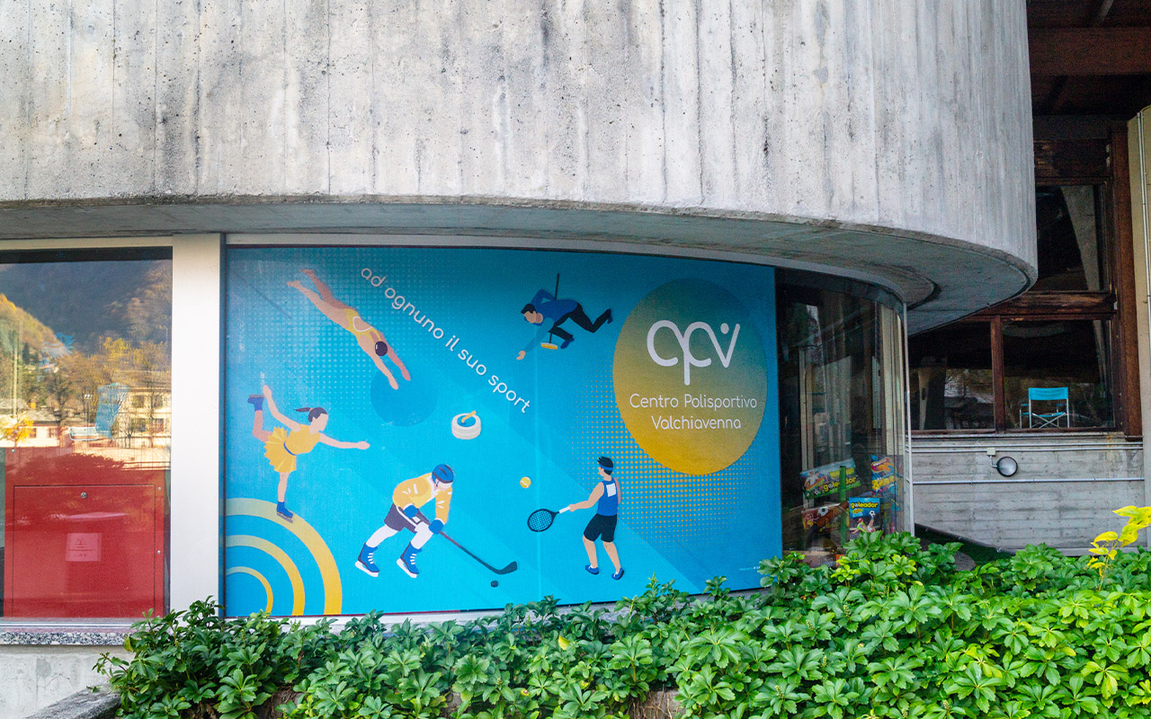
Category Brand Identity
The context:
The Valchiavenna Sports Center, originally founded in 1902 as ASD U.S. Chiavennese, has a long history dedicated to promoting sports. After a period focused solely on soccer, in 2016 the organization transformed into a multi-sport association, expanding its activities to include various sports disciplines and community initiatives. Today, it manages many facilities in the valley and offers a variety of sports and recreational programs for all citizens.
The Center reached out to me as it needed a new Visual Identity to modernize its image and reaffirm itself as a point of reference for sports in Valchiavenna.
Vision:
Our Valchiavenna Sports Center aims to be dynamic, useful, fun, and a gathering point for the youth of our valley and all sports enthusiasts.
Mission:
The mission of the Valchiavenna Sports Center is to promote sports and well-being through inclusive projects and collaborations with schools and communities, ensuring accessibility and attention to disabilities. The Center is also committed to awareness and safety activities, mapping bike trails, and supporting special sports initiatives.
The logo:
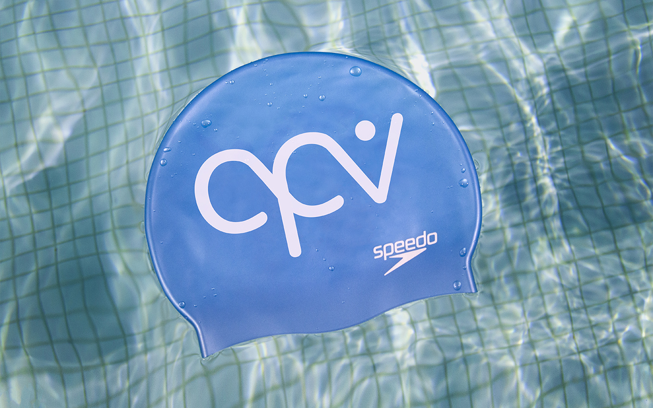
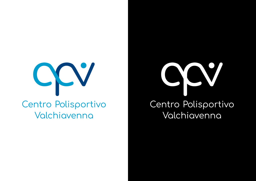
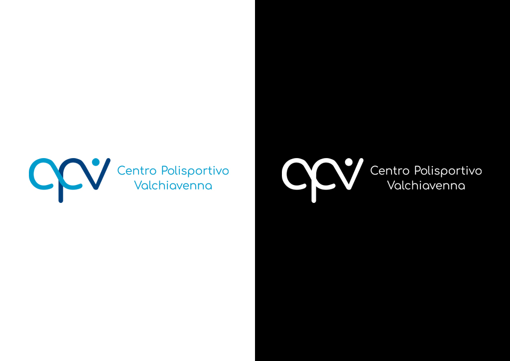
The logo of Centro Polisportivo Valchiavenna consists of a stylized infinity symbol formed by the monogram CPV. The letter "V" in the logo is designed to resemble a small human figure, conveying a sense of dynamism and humanity. This design represents the unity and continuity of the sports activities offered by the center while also symbolizing inclusivity and commitment to the community.
All possible variations of the logo are provided to accommodate different usage contexts and printing techniques.
Color palette:
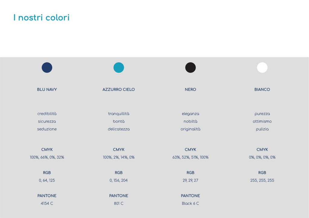
The color palette of Centro Polisportivo Valchiavenna features two main colors: navy blue and sky blue, which best represent the center’s values. Navy blue embodies solidity and reliability, emphasizing the center’s role as a safe and welcoming gathering place for young people and athletes. Sky blue, on the other hand, symbolizes dynamism and vitality, reflecting the energetic and fun spirit of the activities offered. Together, these colors highlight the center’s dedication to fostering an active community and creating an inspiring environment for all.
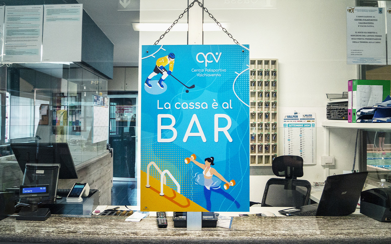
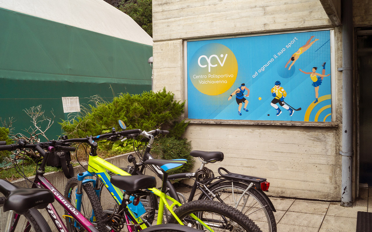
A proper use of the logo, combined with the designated colors and carefully selected typography, will ensure strong recognition and a mutual transfer of values between the center and its users.
Font:
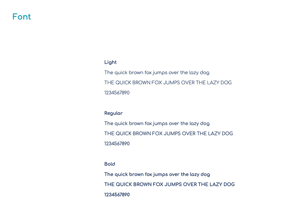
The visual identity of Centro Sportivo Campodolcino includes the use of the Comortaa font: a geometric, rounded, sans-serif typeface. It is suitable for large-format printing while maintaining excellent readability due to its clean design.
Available in three different weights, it offers great versatility and can be used for titles, paragraphs, and notes.
