
Category Graphic Design
The context:
BeeBad is the first energy drink sweetened exclusively with honey.It combines performance and natural ingredients to create a unique product: a clean energy boost that comes directly from honey and carefully selected components. Its philosophy is clear and consistent: natural energy, great taste, and respect for nature. This idea shapes every detail—from the refined packaging to the contemporary communication style.
To explore other projects with a similar nature-inspired approach, you can visit my portfolio page.
BeeBad speaks to people who seek an active, conscious lifestyle and prefer energy drinks made with honest and natural ingredients. If you want to learn more about the product, you can visit the official website: BeeBad.com.
The project:
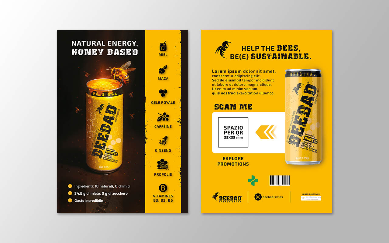
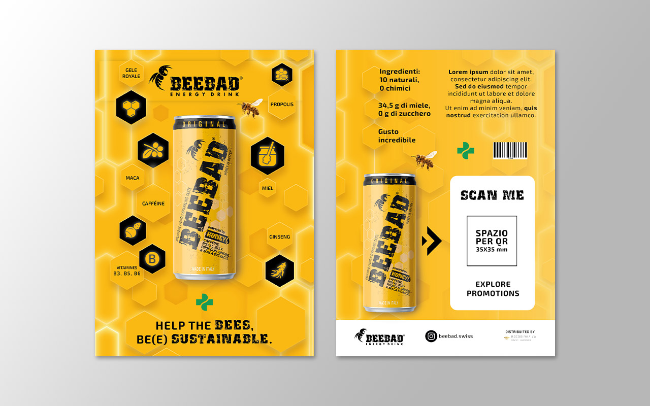
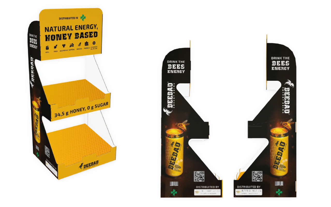
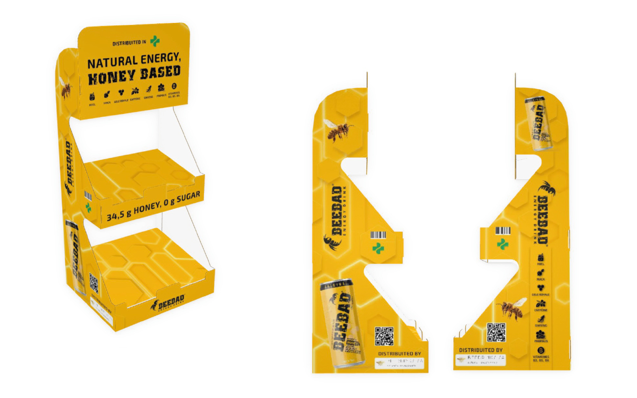
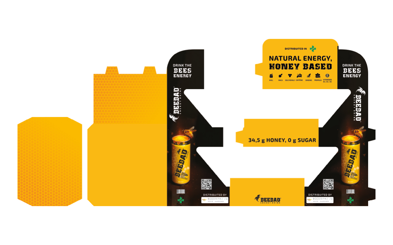
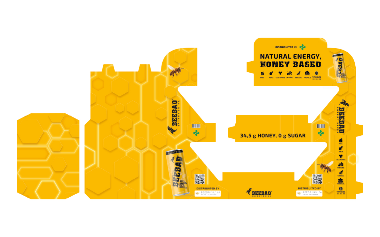
For BeeBad’s pharmacy launch, I created the design for two promotional tools: an A5 flyer and a matching counter display.The brief required a Swiss-inspired visual language—simple, clean, and coherent with the brand’s positioning. The available material was limited: a short video of a prototype can, already opened.
Despite the challenge, the project evolved into two creative directions:
- Black version: bold and striking, with the can revealing an internal beehive and dripping honey, symbolizing pure, natural energy.
- Yellow version: closer to the original request, featuring a geometric neon-style hexagon pattern that blends technology and nature.
Both concepts maintained the same core message: natural energy, sustainability, and ingredient authenticity. The client loved both results and decided to print both designs, using them in different pharmacy contexts.
Why offline materials matter:
Offline materials remain powerful in brand communication:- A well-designed A5 flyer instantly communicates the brand’s values.
- A visually strong counter display increases visibility and builds trust at the point of sale.
- Physical tools create a real, tactile connection with people, reinforcing authenticity.
- They allow the brand to speak in a direct and memorable way, without relying on screens.
- When design and storytelling align, they amplify the brand’s visual identity significantly.
If you want to discover similar identity projects that combine nature, clarity, and brand strategy, take a look at my design services.
