Category Brand Identity
The context:
ATC Livigno facilitates collaboration between the main productive entities of the town to attract tourism and create jobs, working in synergy with the APT, the municipal administration, and other institutions. The association seeks direct and sincere contact with all local operators to solve problems and grow together. The ATC board is always open to dialogue, providing information on projects and welcoming suggestions.The association commissioned a new logo from the agency I was working for, aiming to better represent the values of collaboration, dialogue, and innovation, while adopting a modern and appealing image.
The color palette:
The palette consists of blue and light blue, colors that reflect the values of the association and its attachment to the mountainous context of Livigno. Light blue represents collaboration, transparency, and dynamism, evoking the color of a clear sky. Blue symbolizes trust, stability, and depth, harmonizing with the light blue. These colors strengthen the connection with the territory (blue is also part of the Visual Identity of Livigno) and emphasize the importance of sustainable development.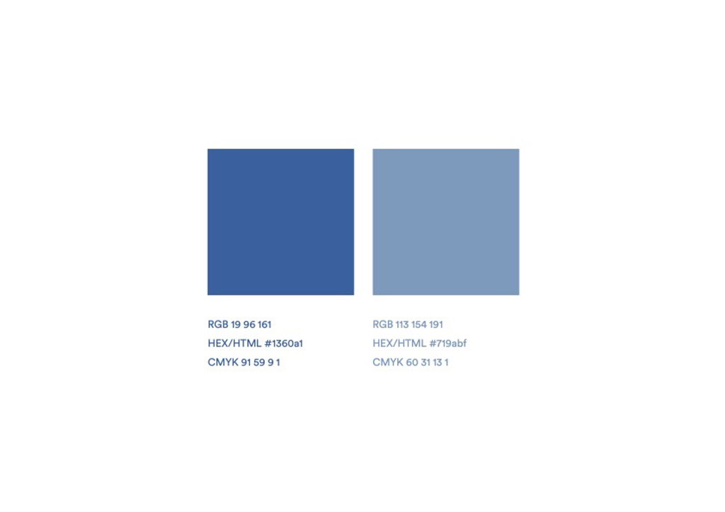
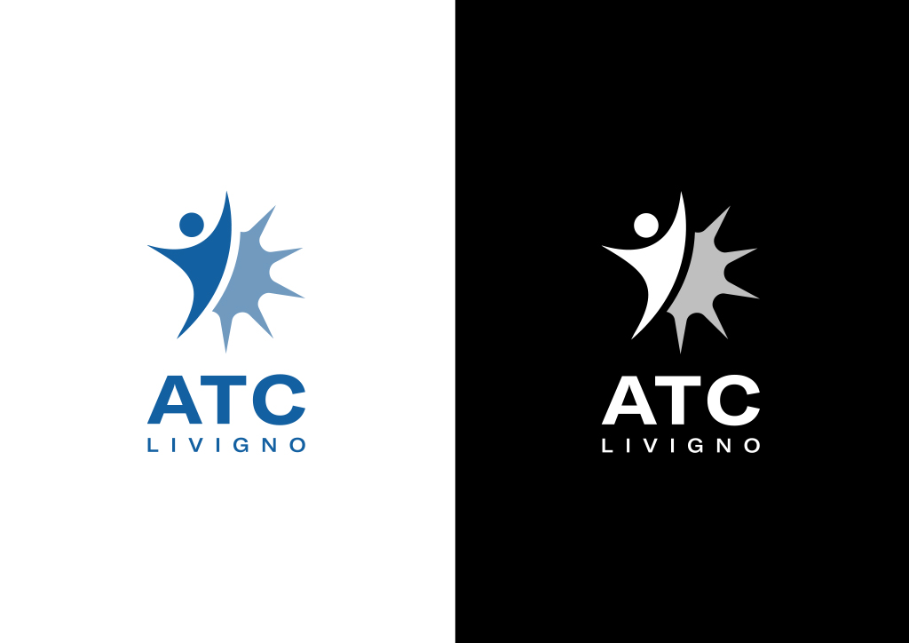
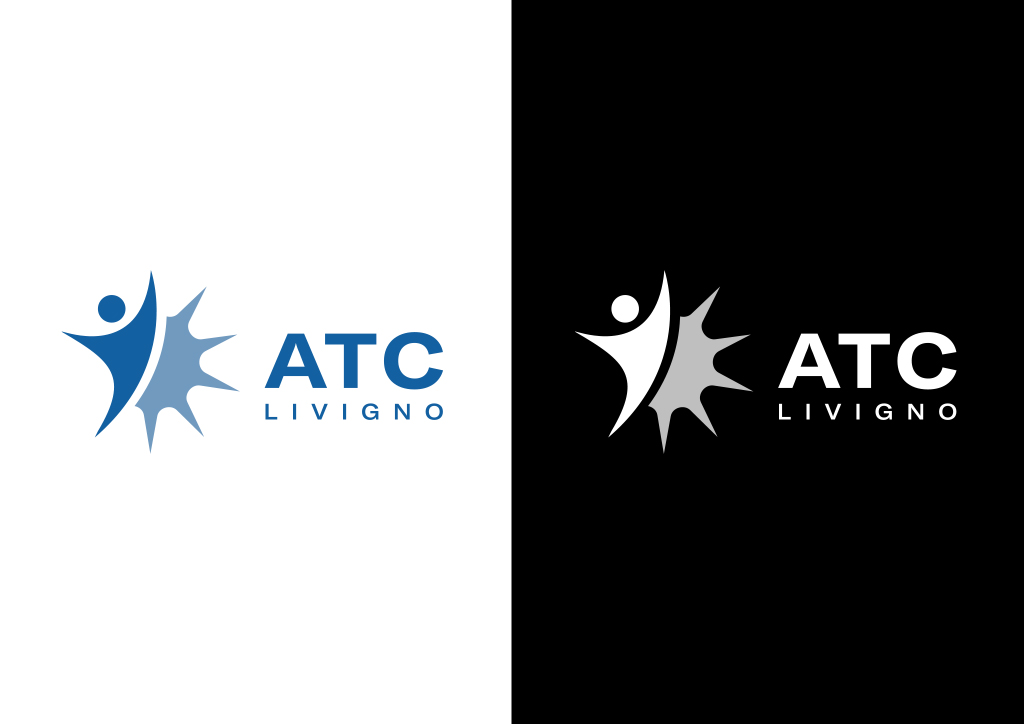
The logo:
The logo is the result of a visual synthesis that connects the representative elements of the territory with the values of the association. The pictogram combines a human figure, symbolizing the human capital of ATC, with the sun, loosely inspired by the Livigno logo, representing the strength of nature and the vitality of the town. This fusion highlights the importance of people and collaboration among them, respecting a challenging yet opportunity-rich environmental context.The font used for the logo is GT America, a sans-serif typeface inspired by Swiss and American typography. The choice of this font, with its clean and modern lines, reflects the innovative approach and professionalism of ATC, emphasizing the combination of tradition and modernity that characterizes both the association and the Livigno community.