Category Brand Identity
The context:
Bigais Design is my small business specializing in Graphic and Web Design, where creativity and a passion for communication take center stage.
This idea originated in 2019, and since then, alongside my work as an employee, I’ve had the pleasure of working on various projects involving coordinated branding, websites, and both offline and online communication materials. Bigais Design is committed to providing unique and innovative design solutions to meet the needs of businesses and entrepreneurs.
The philosophy behind this project is that design should not only be aesthetically appealing but also functional and capable of effectively communicating the core values of a brand.
The project:
The first phase of the project involved analyzing my old Visual Identity, studying competitors, and asking myself a series of questions that led me to identify my core values (creativity, integrity, professionalism, passion). This was followed by defining a coherent color palette.
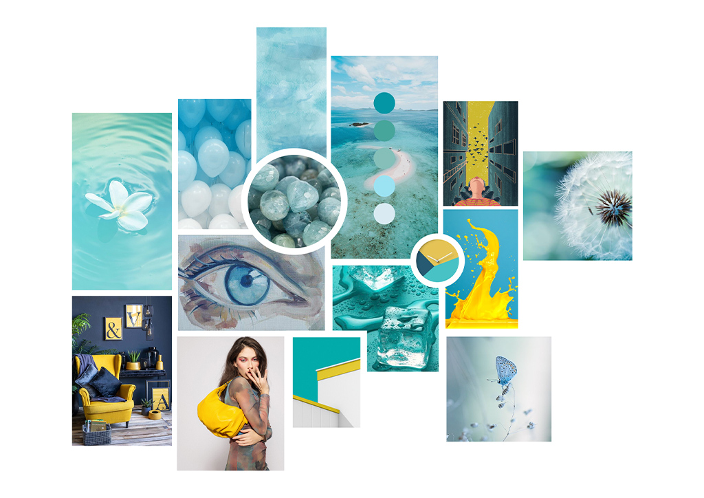
Moodboard:
I visually translated the research into a moodboard— a collection of images that helps extract a design that aligns with the project’s objectives.
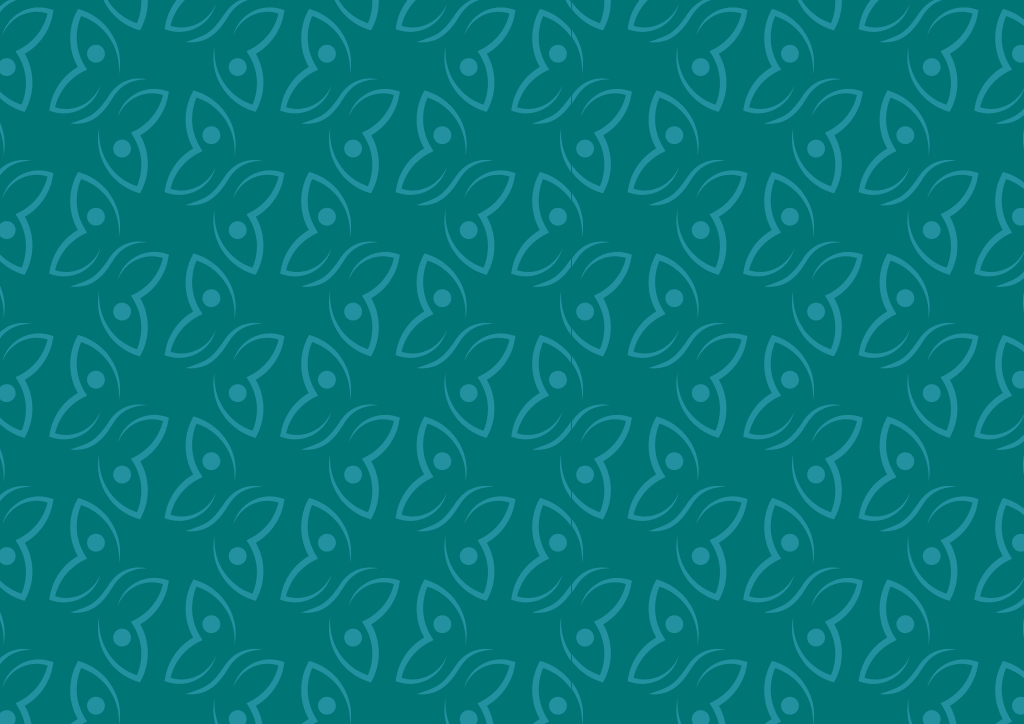
Color palette:
I colori principali di Bigais Design, azzurro e verde acqua, trasmettono freschezza, equilibrio e innovazione, incarnando armoniosamente creatività e professionalità. Il senape aggiunge energia e personalità, fungendo da accento vivace che esprime passione e audacia. Il grigio perla, come colore neutro, conferisce eleganza e sobrietà, bilanciando i toni più dinamici, mentre l’antracite, profondo e solido, enfatizza la serietà e l’affidabilità, completando la palette con un tocco di struttura e raffinatezza. The primary colors of Bigais Design—light blue and aqua green—convey freshness, balance, and innovation, harmoniously embodying creativity and professionalism. The mustard yellow adds energy and personality, serving as a lively accent that expresses passion and boldness. The pearl gray, as a neutral color, lends elegance and subtlety, balancing the more dynamic tones, while the anthracite, deep and solid, emphasizes seriousness and reliability, completing the palette with a touch of structure and sophistication.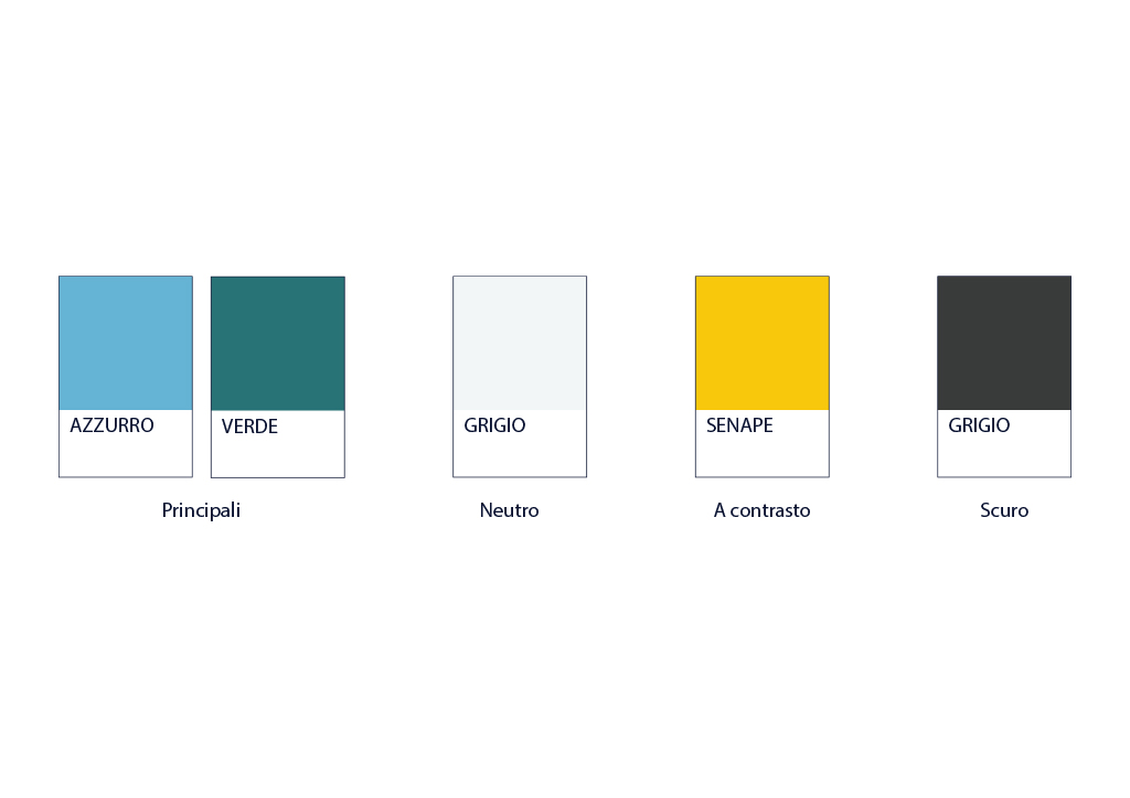
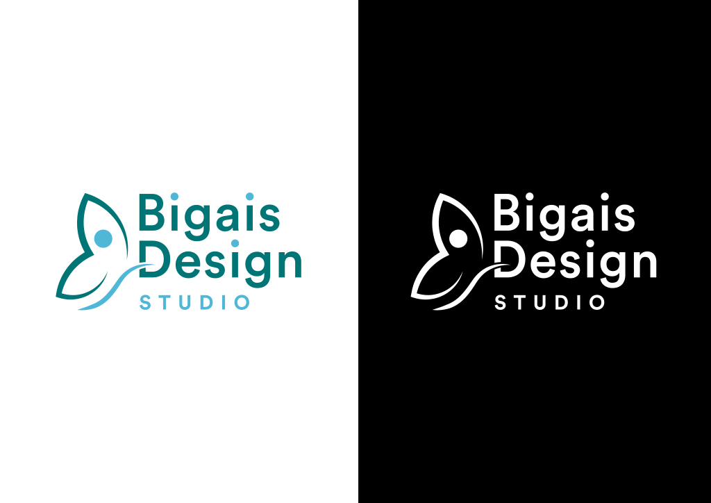
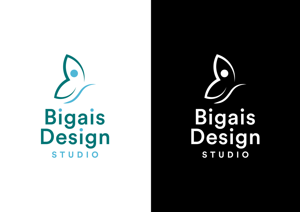
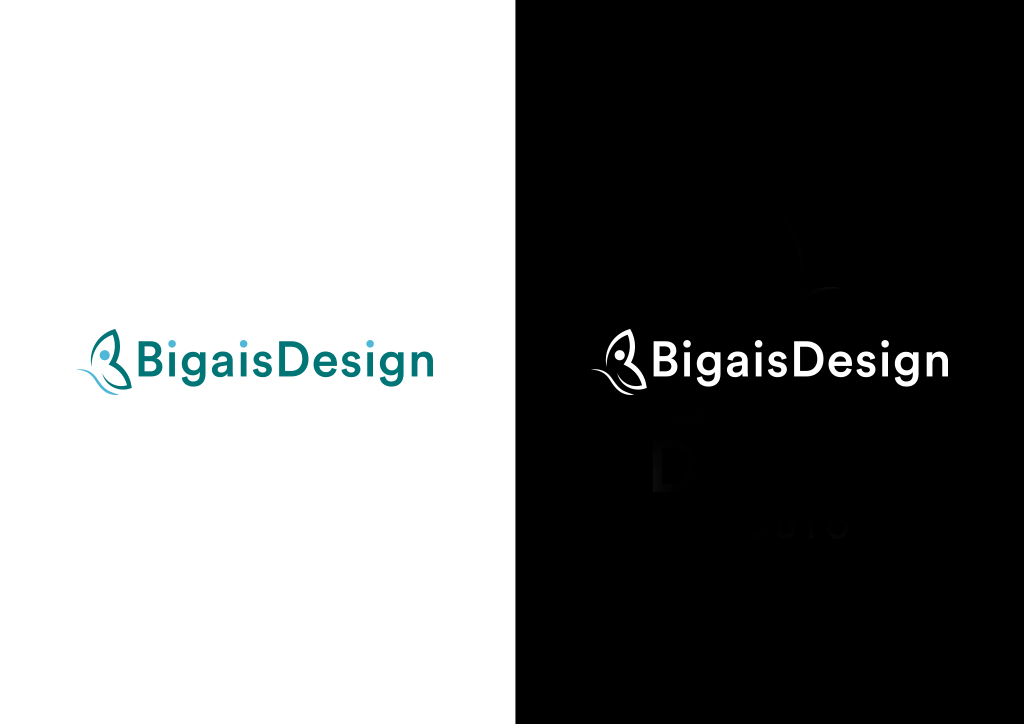
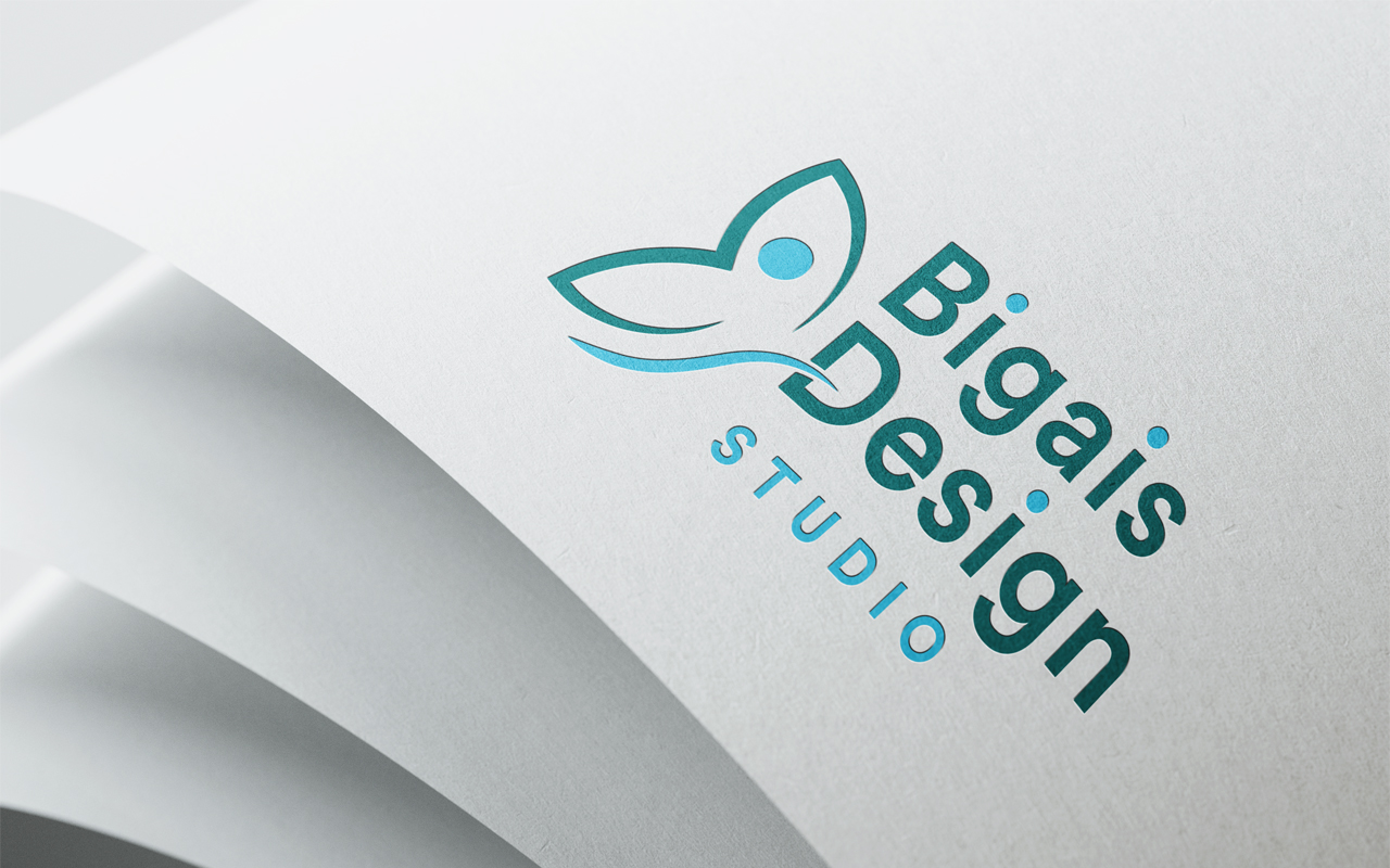
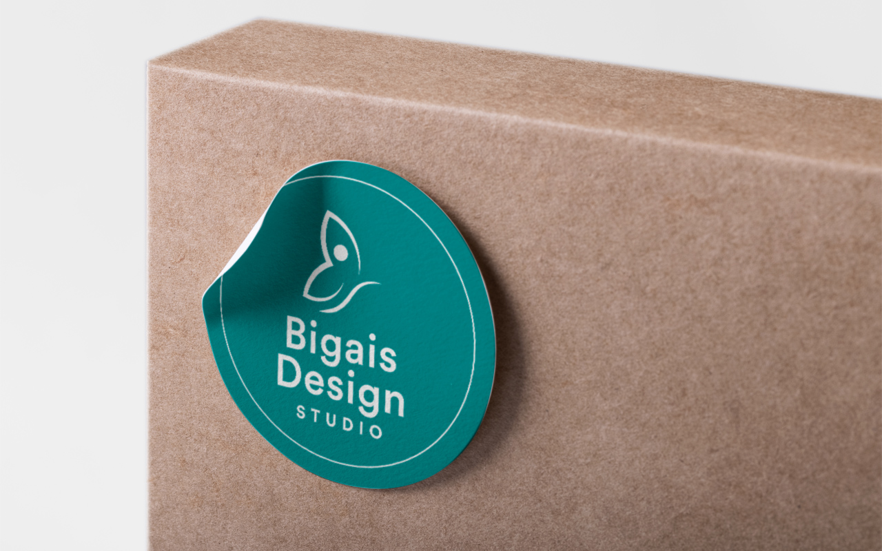
The logo:
The logo symbol is made up of two elements: the butterfly and the eye. These two elements represent me and reflect the feelings I want to convey through my business.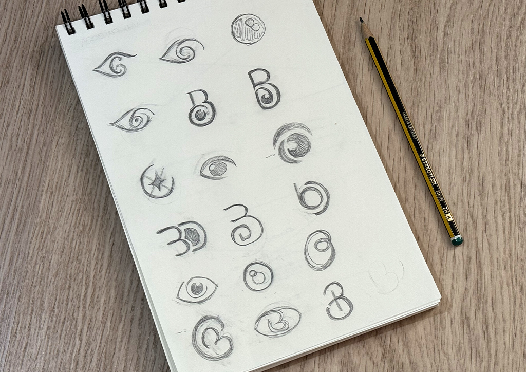
Font choice:
Circular is a versatile sans-serif font with strong geometric shapes that make a strong impact. The choice of this font also helps communicate the brand’s personality. My new logo, in its various forms, fully conveys my values and finally communicates professionalism.