Category Brand Identity
The context:
Campodolcino, surrounded by spectacular mountains and lush green meadows, is an ideal destination for a pleasant and relaxing holiday in a place of incomparable beauty.
Vision:
The Campodolcino Sports Center aims to be the main hub for sports, tourism, and entertainment in the town — a reference point for those who want to combine sport and fun with relaxation and leisure.Mission:
Offrire la possibilità sia ai giovani che agli adulti di praticare diverse attività agonistiche e non, con corsi, campi estivi e possibilità di noleggio in estate ed inverno. Accogliere inoltre le persone al bar, in modo che possano concedersi un momento di svago. To provide both young people and adults with the opportunity to engage in a variety of competitive and non-competitive activities through courses, summer camps, and rental services available in both summer and winter. The center also welcomes visitors at its bar, offering a moment of relaxation and enjoyment.The logo:
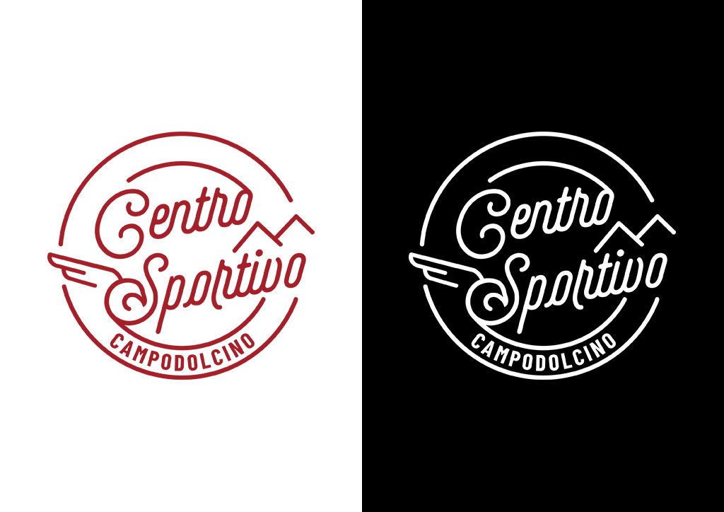
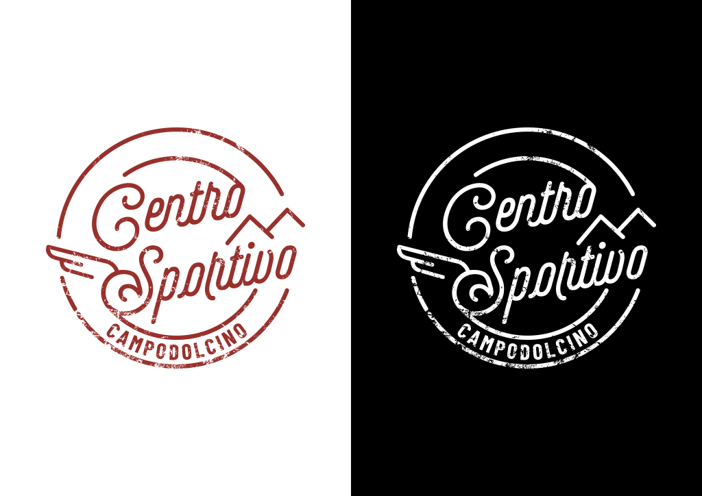
The logo is an emblem that incorporates mountains — symbolizing our strong connection to the territory — and an eagle, representing the Chiavennese sports club that manages the Center.All logo variations are provided to suit different applications and printing techniques.
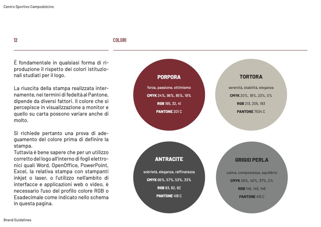
Color palette:
The color palette of the Campodolcino Sports Center includes purple and taupe as the primary colors, with anthracite gray and pearl as secondary tones. Purple symbolizes energy and passion for sports and entertainment, while taupe evokes a sense of warmth and relaxation. Anthracite gray and pearl are elegant, neutral shades that pair well with the primary colors, offering versatility in design applications.Proper use of the logo, combined with the color scheme and carefully selected typography, ensures brand recognition and a strong value exchange between the Center and its audience.
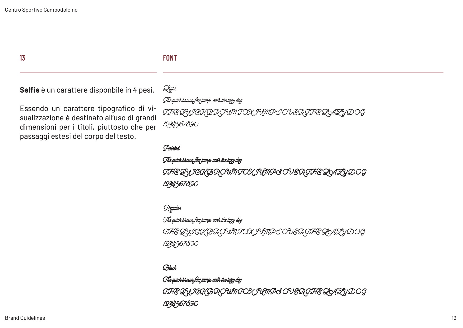
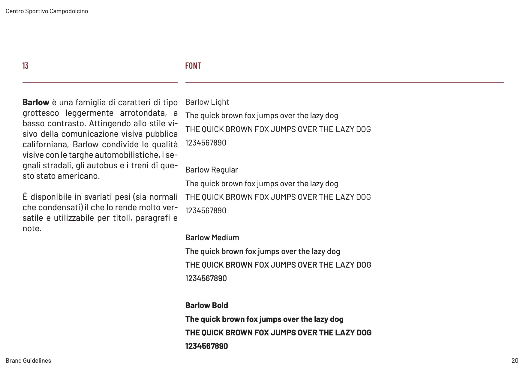
Font:
The visual identity of the Campodolcino Sports Center uses the Selfie and Barlow fonts. Selfie adds a modern and friendly touch with its smooth, flowing lines, while Barlow, with its clean and geometric design, ensures readability and professionalism — creating an appealing and accessible visual balance.