Category Brand Identity
The context:
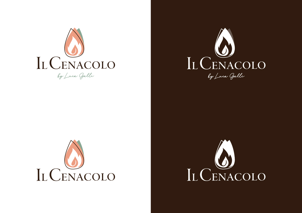
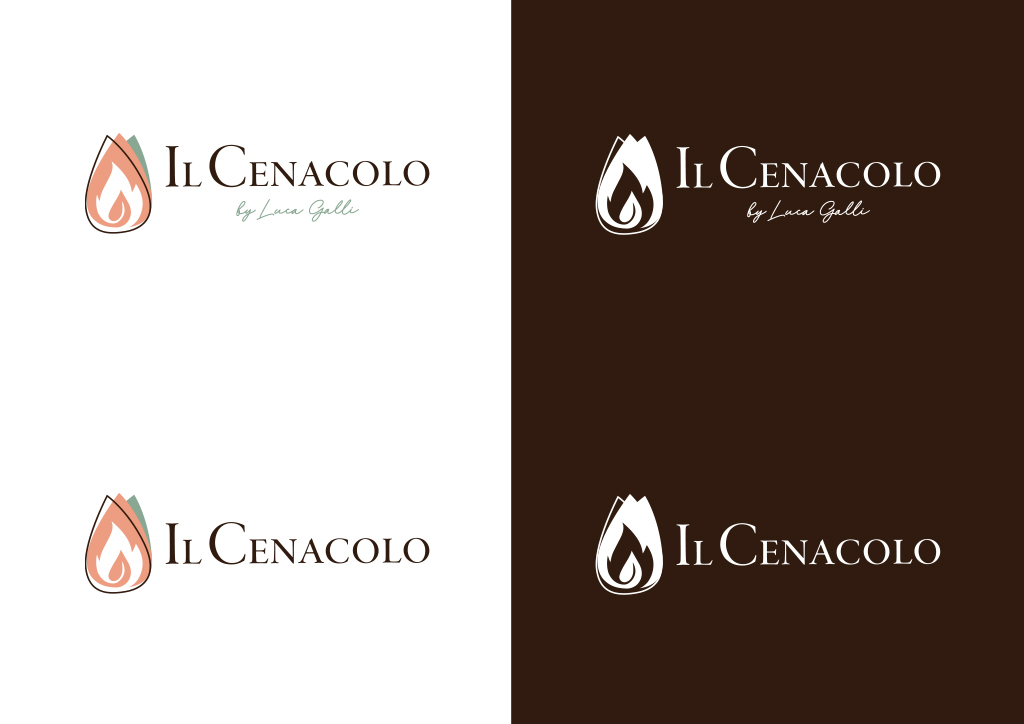
Ristorante Il Cenacolo in Livigno, a landmark of culinary tradition in the Upper Valtellina, needed a new logo that would reflect the values of its new management: culinary tradition, creativity and innovation, hospitality, and passion. The restaurant, where Chef Luca Galli blends traditional Valtellina cuisine with the freshness of Mediterranean ingredients, turned to the agency I was working for. The new logo perfectly captures the love for authentic flavors and creativity, reflecting the essence of the restaurant’s delicious and unique dishes.The color palette:
The brand’s color palette includes sage green, peach, and brown. Sage green evokes the freshness of the ingredients used in cooking and the surrounding nature, while peach adds warmth and hospitality, conveying a sense of welcome. Brown recalls the tones of wood and mountain tradition, adding depth and solidity. This color combination balances tradition and modernity, creating an image that perfectly represents the welcoming atmosphere and culinary values of the restaurant.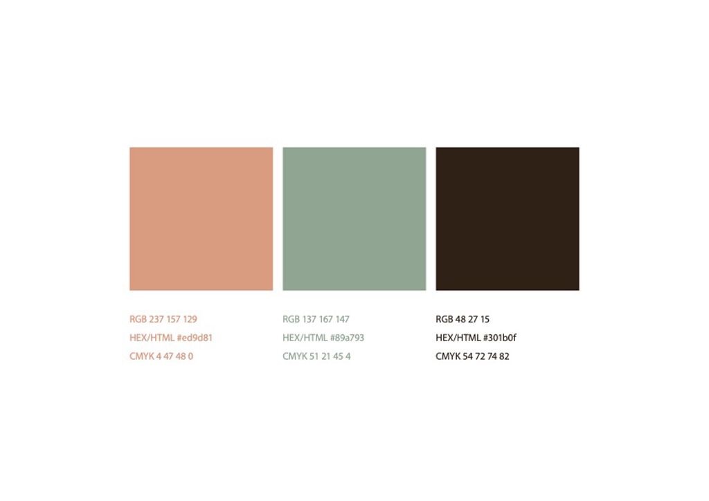
The logo:
The logo of Ristorante Il Cenacolo in Livigno consists of a pictogram that combines a leaf and a flame, symbolizing the freshness of the ingredients and the passion for cooking and the world of gastronomy. For the logotype, we chose the EB Garamond font, one of the finest serif fonts, and one of the oldest as well: it embodies the attempt to convey elegance and authority. The logo is complemented by a creative and refined payoff: the authentic signature of Chef Luca Galli, adding a personal touch that emphasizes the high level of the cuisine.