
Category Graphic Design
The context:
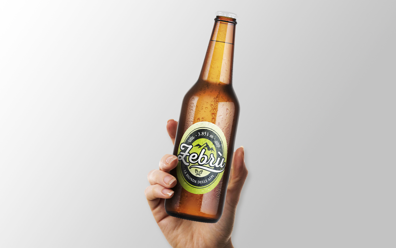
Zebrù Beer is an authentic craft beer from the Alps, born in Bormio. With its light body and aromas of flowers, herbs, and noble hops, it embodies the spirit of those who love untouched mountain landscapes. Available in varieties such as a well-balanced lager and a Rye IPA, it stands out for its use of ingredients like organic alpine rye and selected malts, offering true alpine flavor and character.
The project:
As a Graphic Designer at Bonazzi Grafica, I was tasked with rethinking the visual identity of Zebrù Beer. The previous branding heavily featured a zebra—an element that clashed with the brand’s core values: craftsmanship and a deep connection to the Alpine territory.
The project began with the creation of a new logo that reflects authenticity and a strong bond with the Alps, removing visual elements that felt inconsistent. Building on this new foundation, I designed the updated labels, which I printed myself on adhesive film using UV ink, producing multiple color variants directly at the print shop.
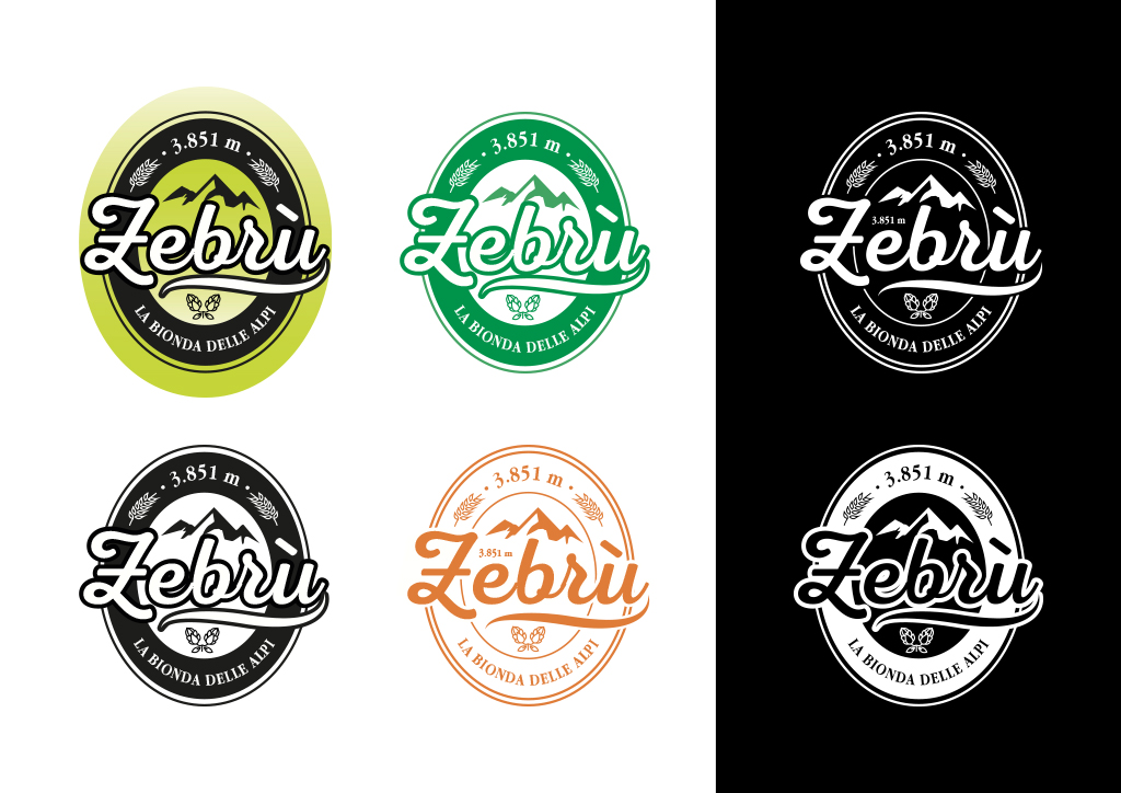
Zebrù Beer’s new identity embraces an emblematic and traditional style, typical of artisanal beers. Its key features include:
- Iconic local elements, such as stylized mountains, symbolizing the connection to the Alpine landscape.
- Decorative script fonts, giving the label an artisanal and refined look, consistent with the brand’s values.
- An oval label, echoing the classic aesthetics of vintage beer bottle labels.
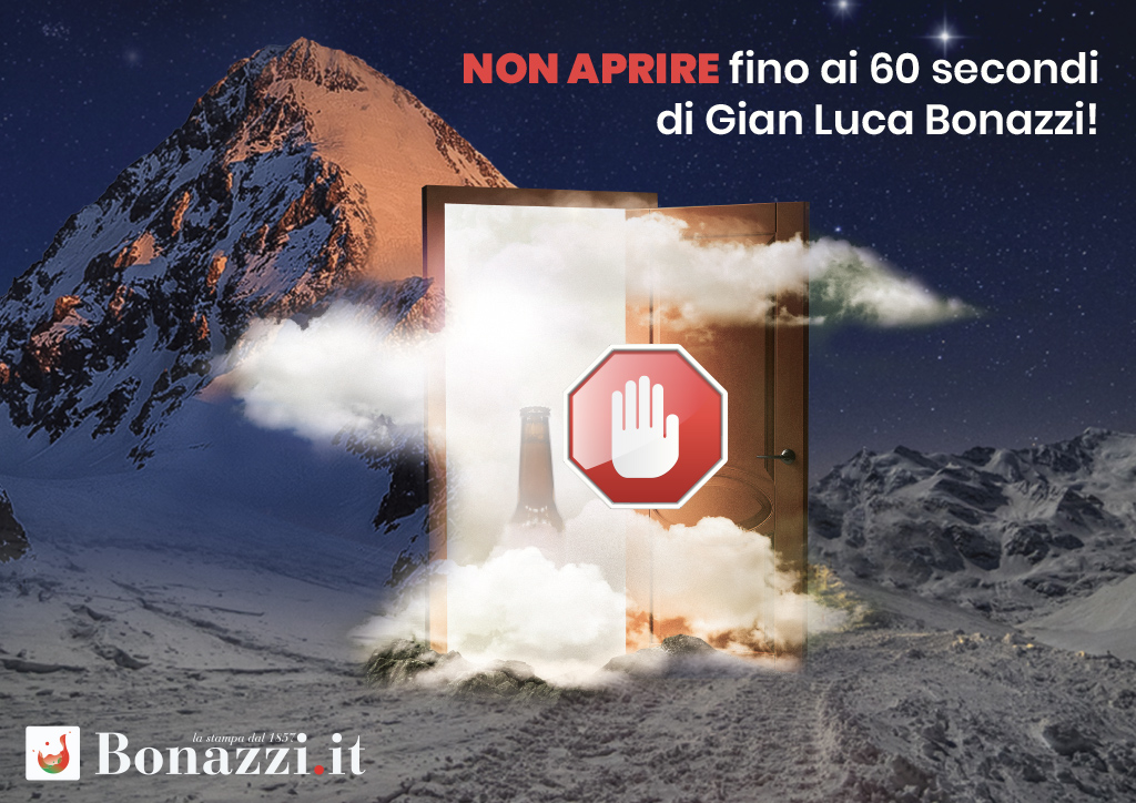
The new look of Zebrù Beer bottles was officially unveiled during the BNI Quasar 2.0 Chapter meeting. In a 60-second pitch, the brand's refreshed image was presented. This moment was an opportunity to share Zebrù's evolution toward a visual identity that truly reflects its values and territory, while also collecting valuable feedback from fellow entrepreneurs.
