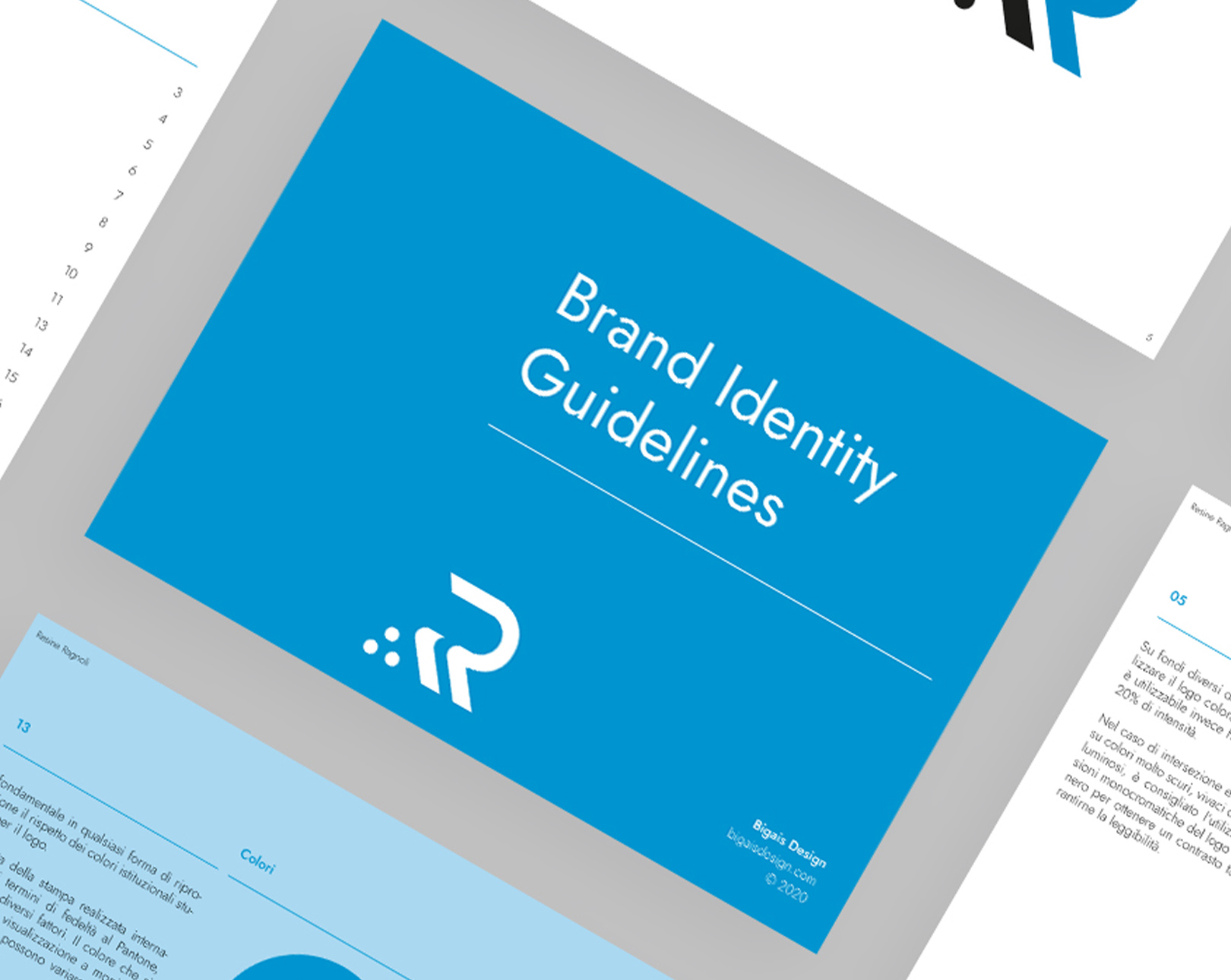
Category
Vision and mission
Defining these two objectives (based on the company’s values and aspirations) is very important in order to have a clear understanding of what and how you want to communicate, as well as the direction you intend to take with your business.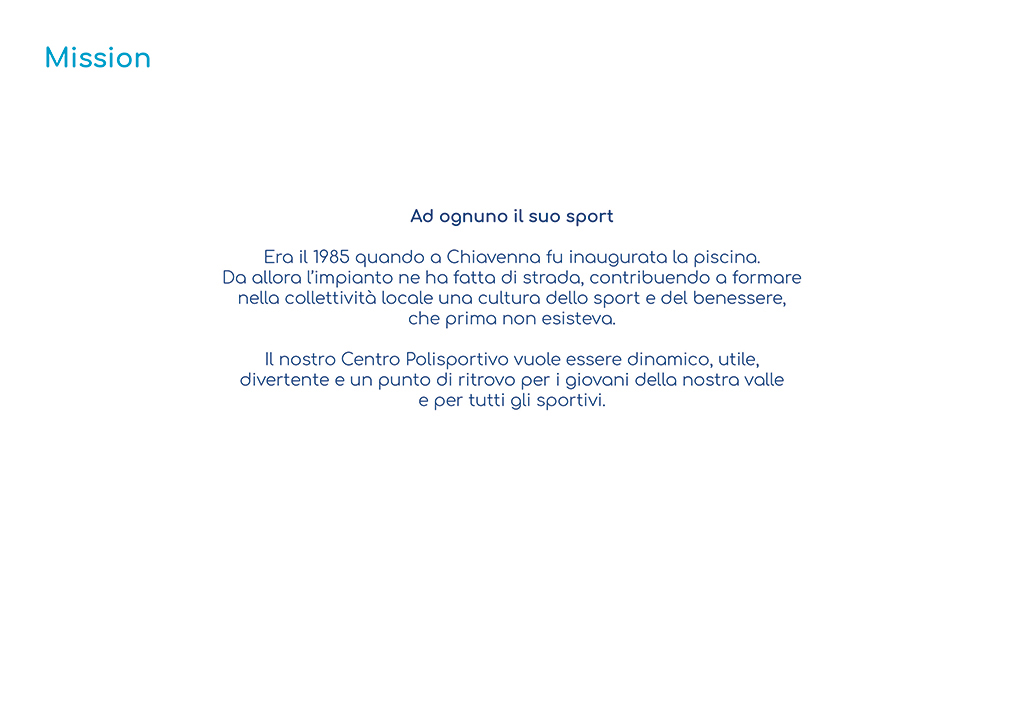
Configuration
The logo will be applied to a variety of materials, so it requires a flexible system that includes both vertical and horizontal solutions.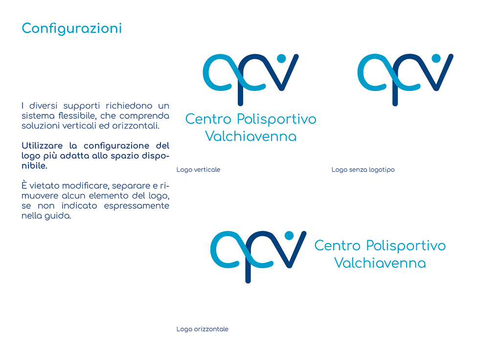
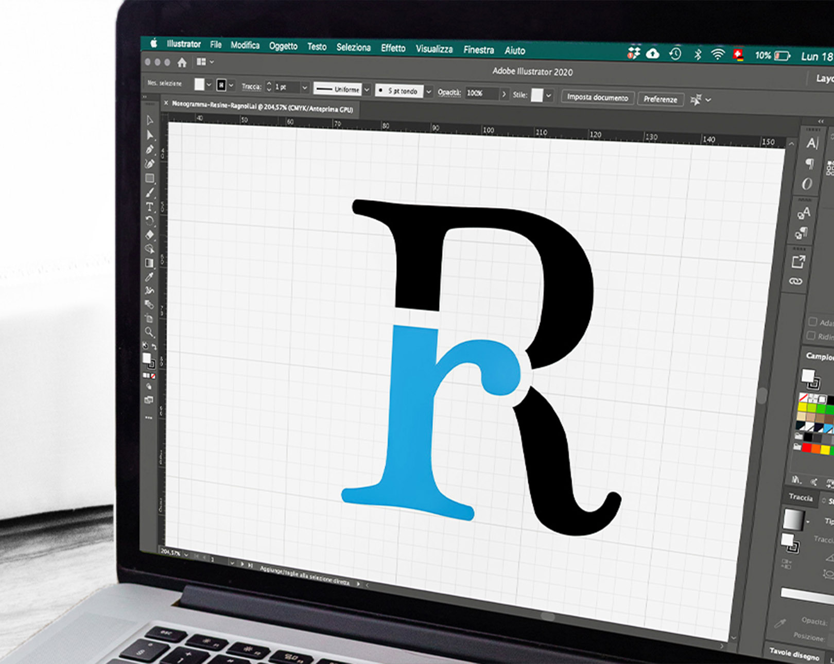
Structure
The structure of the logo follows a geometry that ensures readability and compositional harmony. It is built on a grid, which serves as the foundation of the logo. Without this grid, alignments and proportions would be left to chance (would you want your house built randomly? Well, imagine doing the same with your logo, which is a fundamental part of your image and helps position you as a professional!). Respecting this geometry and the distances between the design and the text are integral parts of the logo and must always be taken into consideration.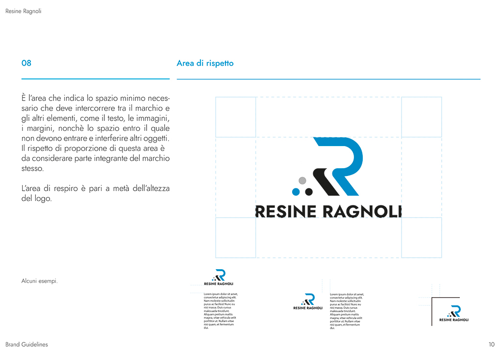
Usage examples
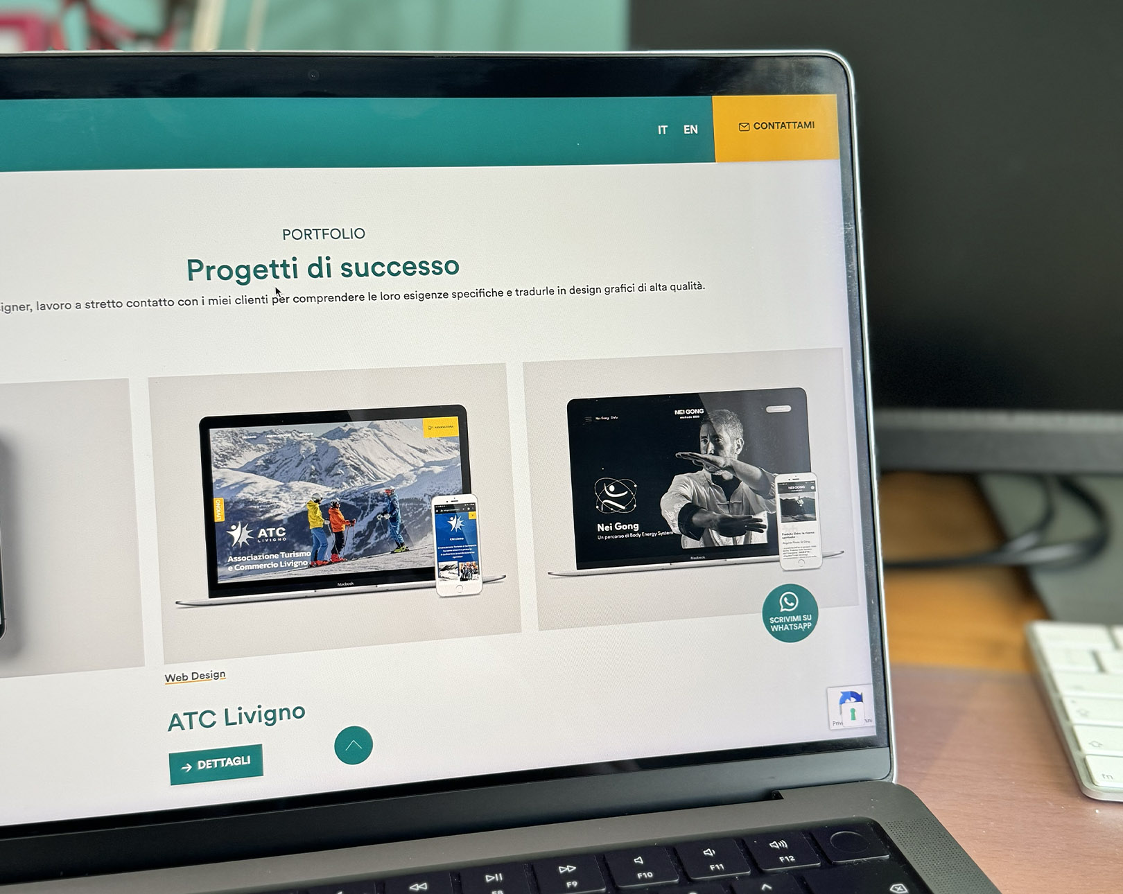
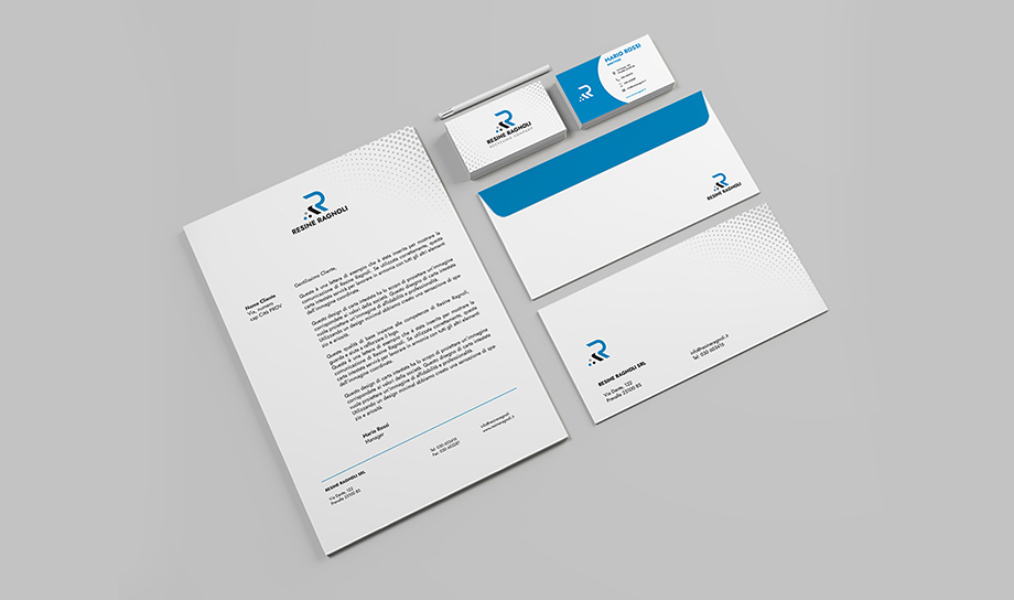
It is essential to define how the logo will be applied in the creation of communication materials related to the brand. This includes business cards, letterheads, envelopes, and, if necessary, even promotional items and products. Nothing is left to chance!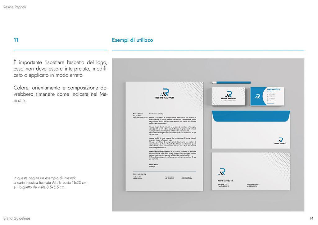
Mistakes to avoid
It’s important to respect the logo’s appearance; it should not be interpreted, altered, or applied incorrectly. For this reason, one section includes examples of the most common application mistakes that can occur.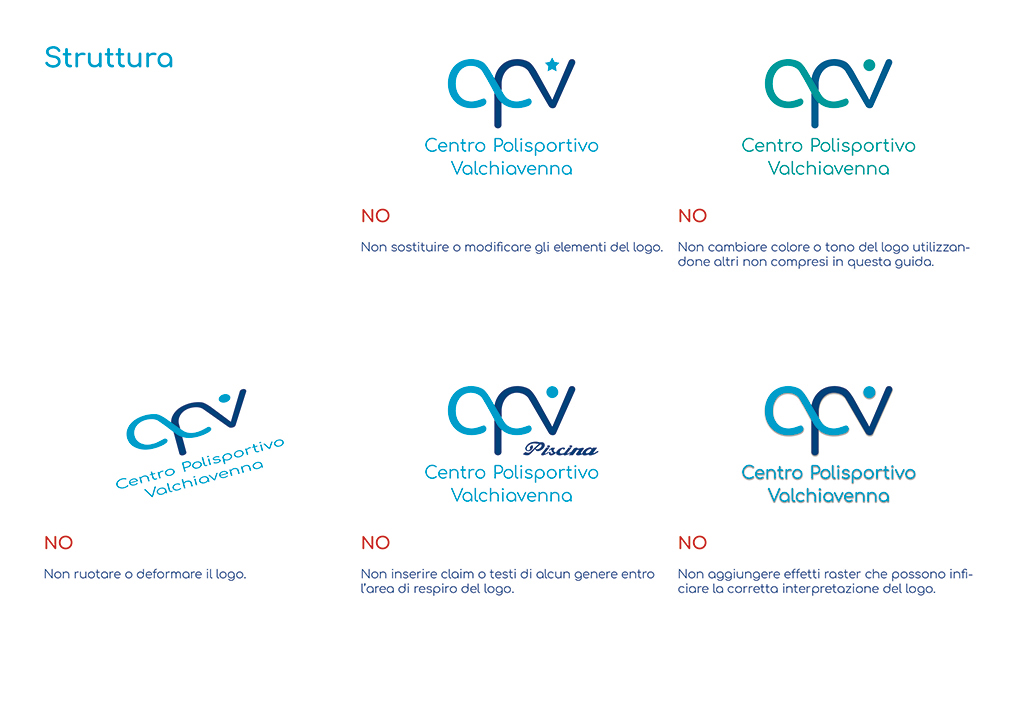
Colors
The brand colors are chosen based on the values the brand wants to communicate. These colors are specified, along with the color variations to use to ensure readability on any background. The color palette is one of the key elements of the logo, as it makes it instantly recognizable.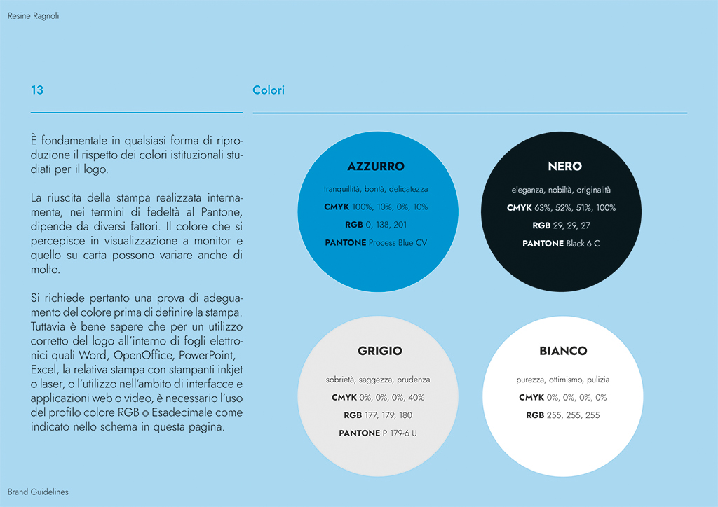
Typography
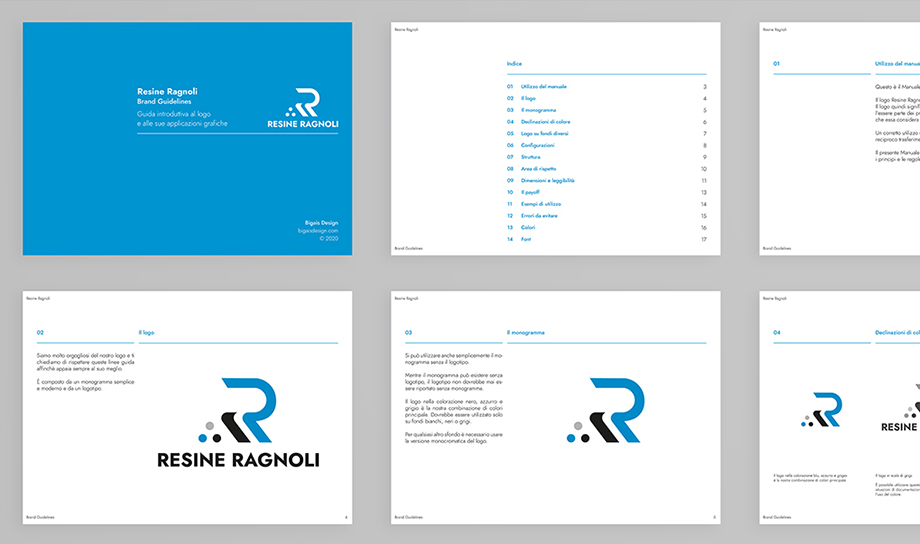
Here, the fonts to be used for all communications, both print and digital, are specified, along with which typeface should be used for titles and body text.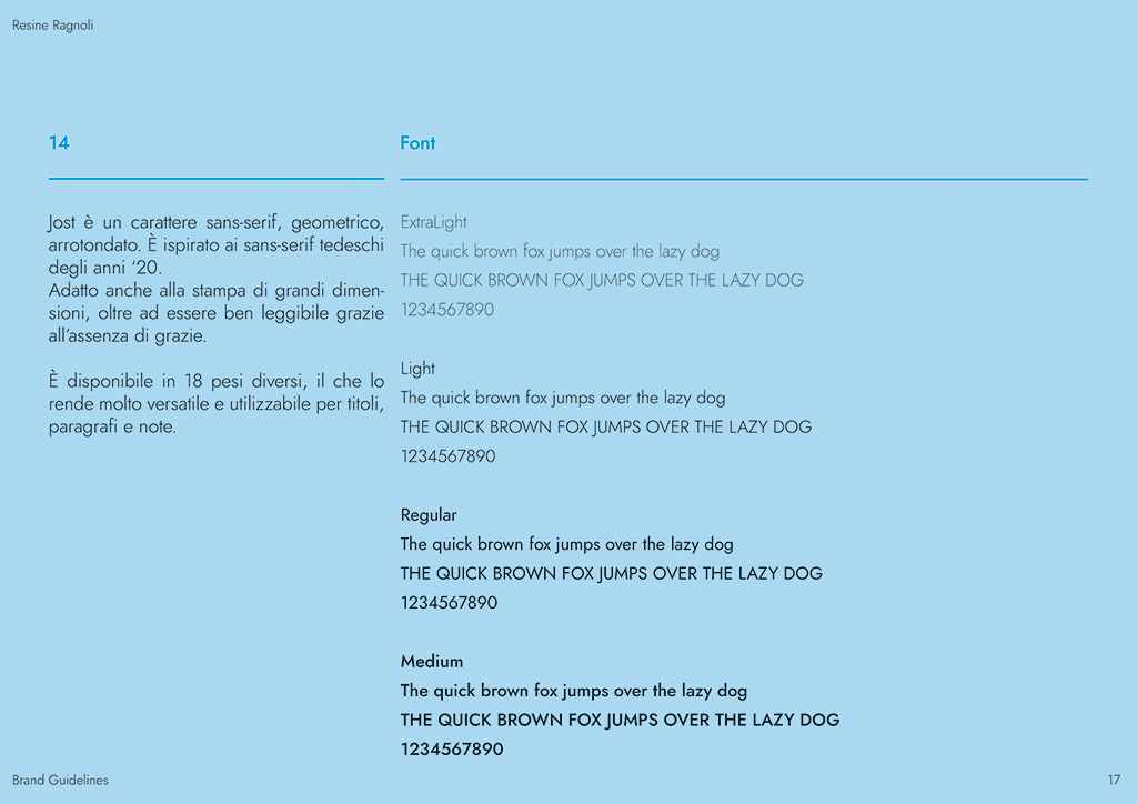 Come avete potuto vedere sul manuale si torva qualsiasi specifica riguardo al logo (queste sono solo alcune, un brand manual può essere composto anche da un centinaio di pagine, a secondo della complessità del progetto), il che sarà molto utile quando vi troverete ad utilizzarlo nella vostra comunicazione.
Il logo non dovrà quindi essere soltanto bello, ma anche versatile e utile!
Le regole devono essere dettagliate ma non eccessivamente rigide. Un buon equilibrio permette di raggiungere un ottimo risultato senza limitare troppo la creatività.
Proprio perché comprendo la difficoltà che si prova ad approcciarsi a una professione che come quella del designer è tanto concreta ma all’apparenza astratta (spero riusciate a cogliere questa sfumatura), mi piacerebbe trovare un modo per far conoscere a quante più persone (curiose) possibili questa professione.
N.G.
Come avete potuto vedere sul manuale si torva qualsiasi specifica riguardo al logo (queste sono solo alcune, un brand manual può essere composto anche da un centinaio di pagine, a secondo della complessità del progetto), il che sarà molto utile quando vi troverete ad utilizzarlo nella vostra comunicazione.
Il logo non dovrà quindi essere soltanto bello, ma anche versatile e utile!
Le regole devono essere dettagliate ma non eccessivamente rigide. Un buon equilibrio permette di raggiungere un ottimo risultato senza limitare troppo la creatività.
Proprio perché comprendo la difficoltà che si prova ad approcciarsi a una professione che come quella del designer è tanto concreta ma all’apparenza astratta (spero riusciate a cogliere questa sfumatura), mi piacerebbe trovare un modo per far conoscere a quante più persone (curiose) possibili questa professione.
N.G.